
I think the Suntup Editions could fairly be described as a fine press phenomenon, having built a reputation for highly sought-after editions of popular books and laid a template business model for later publishers to follow. But the press’ output has not featured on this blog until now. Press proprietor Paul Suntup has been kind enough to provide, on loan, a review copy of his edition of Roald Dahl‘s Charlie and the Chocolate Factory to address this lacuna.
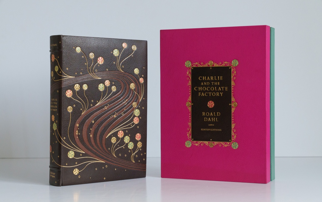
Published in 2022, the edition was issued in four states: Artist Edition (1250 copies at US$185), Numbered Edition (350 copies at US$950), Lettered Edition (26 copies at US$5,500), and Roman Numeral Edition (10 copies at US$14,500). Each of the four states has its own distinctive individual design vision. For example, the artist edition is wrapped in a dust jacket that looks like a partially opened bar of Wonka’s chocolate, while the lettered state beckons you to enter with a case mimicking the gates to the eponymous factory. Here, though, I have the opportunity to take a close look at the rare roman numeral state and see what sets it apart.
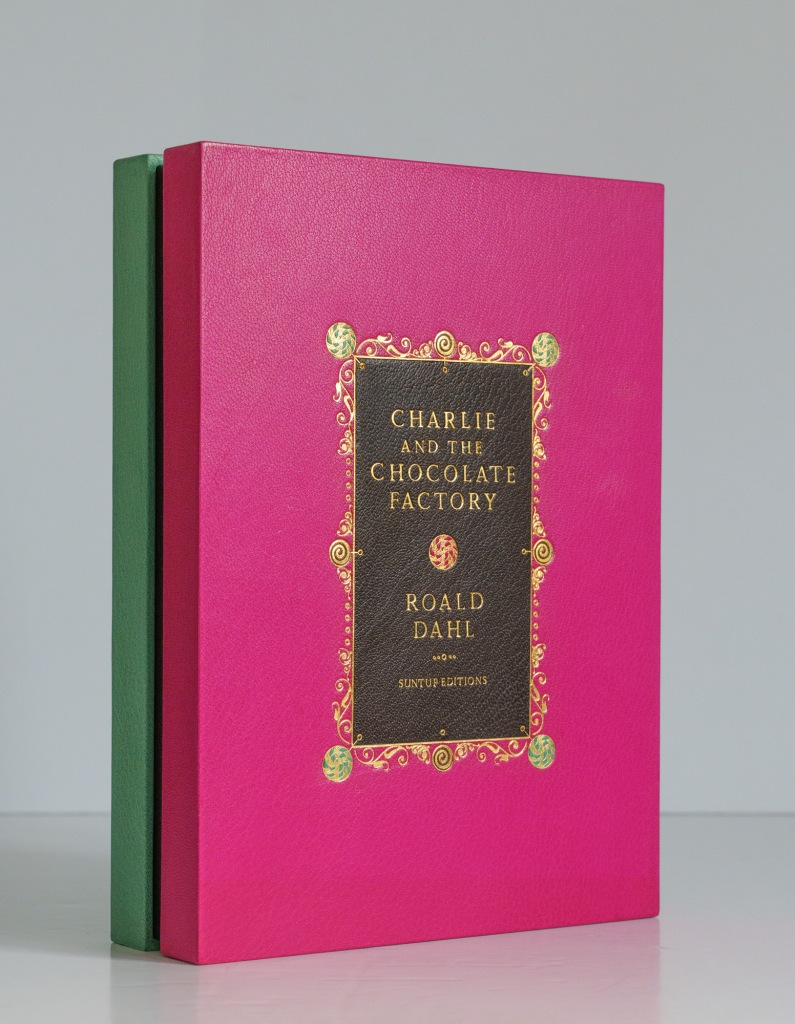
Presentation box
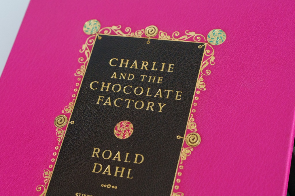
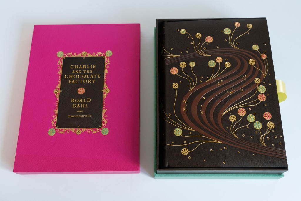
I’m not known for my romantic impulses so my girlfriend’s first reaction—before I explained that there was a fourteen-thousand dollar book on the coffee table and she might to put her mug of tea elsewhere—was to wonder why I had brought a box of chocolates home. That’s because this roman numeral edition is presented in a two-part box that looks uncannily like the tray of high end chocolates you might buy to say “I love you” (or “sorry, I screwed up”). But this isn’t quite like any box of chocolates I have seen before. The box is covered in a smooth goatskin leather; pink for the lid and turquoise for the base, with a sliver of chocolaty brown running between them. The front of the box is delicately tooled with the title, author’s name and confectionary motifs, and includes leather onlays. The lid opens to an interior that’s lined in brown suede.
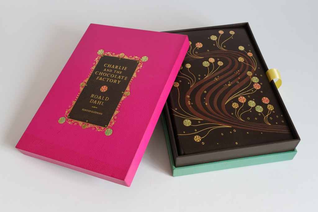
A broad yellow satin ribbon pull helps us to remove the volume from its enclosure. The ribbon is attached to a lifting panel (also suede-lined) that is used to raise the book. This solution feels a bit more elegant and stable than the usual solution of just having the ribbon pull directly on the book.
Exterior details
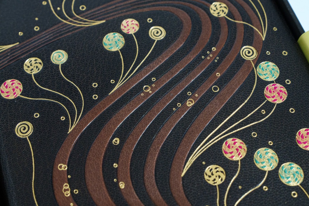
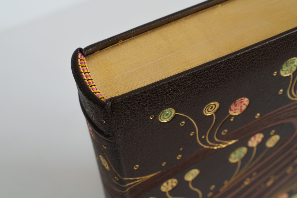
There’s nothing in the box other than the volume itself. I don’t think that’s a bad thing—there’s something to be said for letting a fine book speak for itself. And it’s clear from the outset that this book has something to say. The binding is brown full goatskin leather with a flawless even grain and that nice robust tactile quality of a fine leather. It is inlaid in a lighter shade of brown with a motif representing a chocolate river, which here flows in serpentine fashion across the cover. Emanating from the river are gold tooled confections inlaid with pink and green leather, with special tools having been manufactured for the job. The whole design wraps around onto the back board, crossing a spine featuring two raises bands for an understated classic look. The title, author’s name and the name of the press are all hand blocked on the spine, with the titling small enough to run horizontally rather than vertically, which I always find to be quite elegant. All three edges of the text block are gilded and we have hand-sewn end bands—a nice upgrade from the glued-on cosmetic ones we see so often elsewhere. All of the gilt you see on the binding is 24ct gold. The binding was executed by hand by famed binder Shepherds, Sangorski & Sutcliffe. All of the parts fit together beautifully.
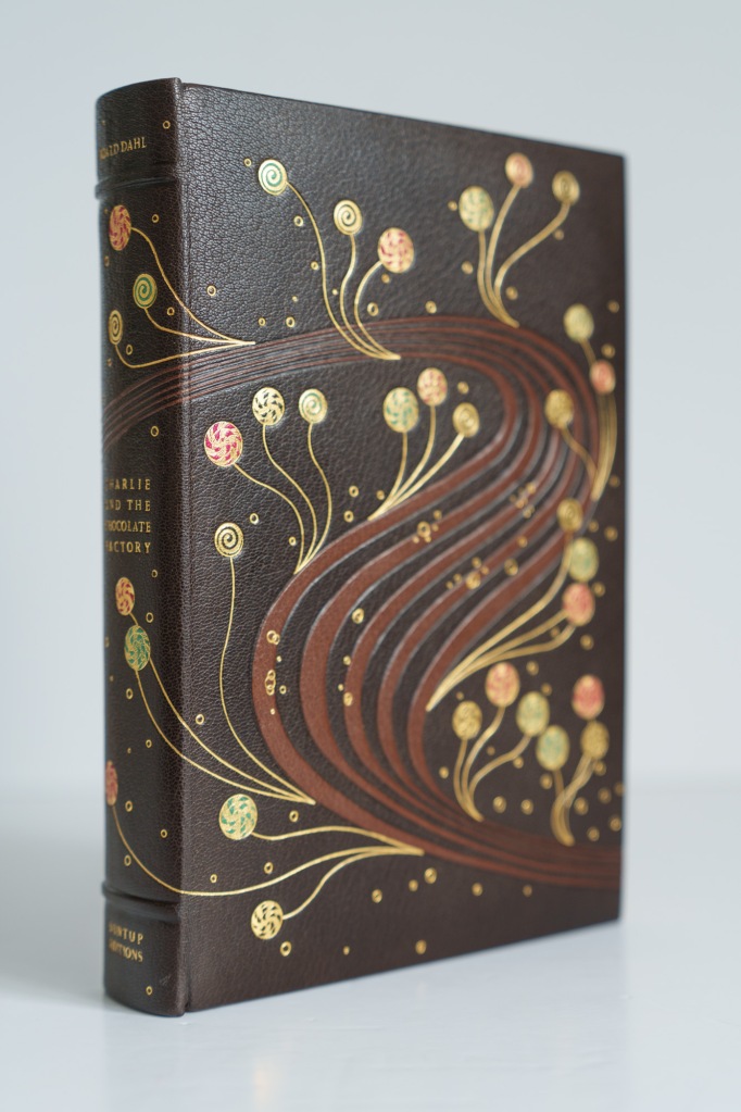
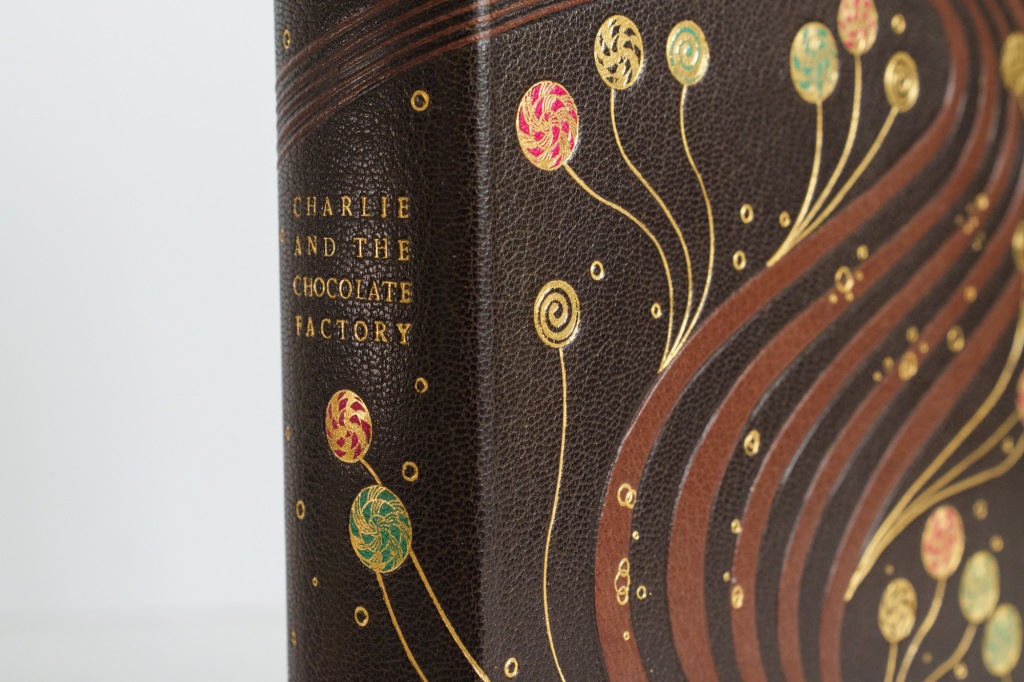
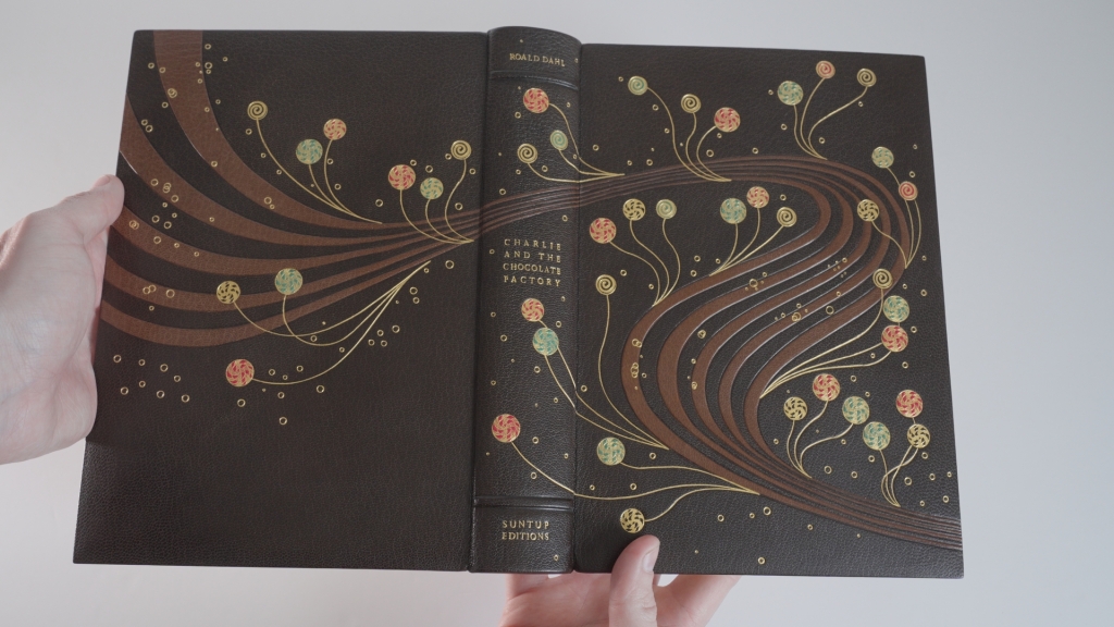
I really liked this binding very much. The design is subtle and classical rather than ostentatious, while remaining interesting and non-generic. It feels superbly well made and overall reminds me in both its style and execution of the high-end “designer bindings” that serious collectors sometimes commission for their most treasures books. If I owned a copy of the book, I’d almost be tempted to put the presentation box, nice as it is, aside because the book just looks so handsome on a shelf.
Interior details
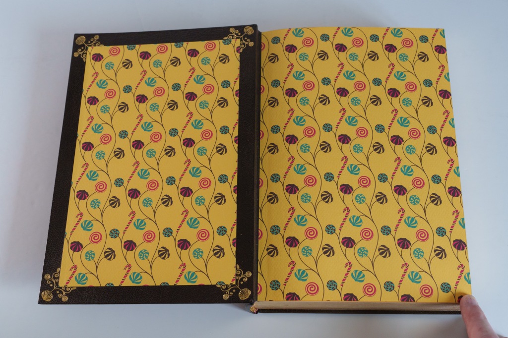
Opening the cover reveals endpapers custom printed with a candy-themed design on yellow paper. The hinge is leather rather than paper to improve strength. The pastedown is framed with tooled gilt motifs.
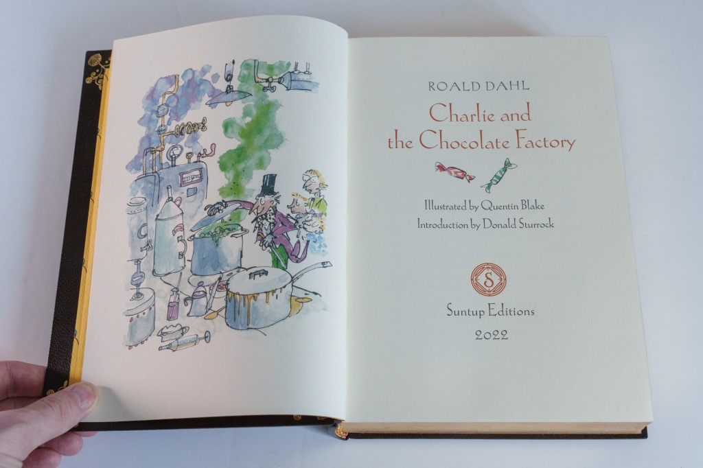
The book proper is printed on Rives Heavyweight mould-made paper. This is a nice paper with a slightly fuzzy surface texture that lends it a pleasant tactile quality. It has a subtle off-white colour and very good opacity. The printing has been done letterpress by Bradley Hutchinson on a Heidelberg cylinder press and exhibits a modest bite. It was impossible to find fault with the quality of the printing work. The main text is set in Bruce Rogers’ glorious Centaur typeface, a personal favourite, while the display elements use Koch-Antiqua. Printing throughout is two-colour, with chapter header ornaments set in a russet ink.
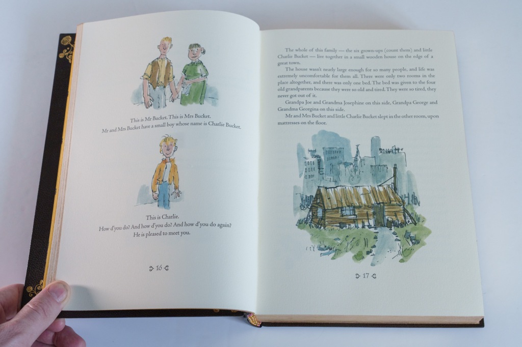
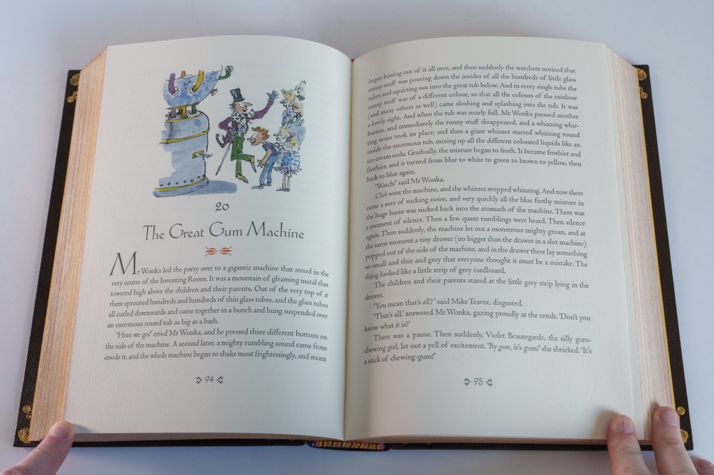
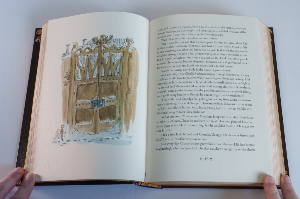
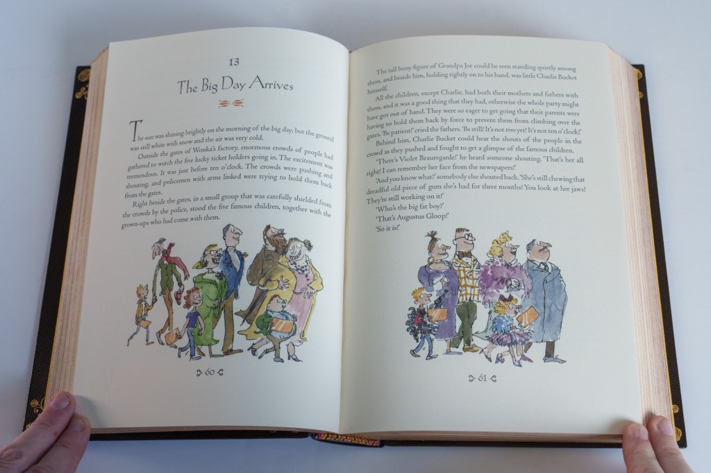
The book is very liberally scattered with colour illustrations by Quentin Blake. Based on the fact that there’s an image on approximately every second or third spread of a novel spanning 150 pages, there must be around 60–70 illustrations. These images date back to the mid-1990s when Blake first produced them for a trade edition of the novel. Here they are printed offset but the reproduction is good and the paper does a great deal to flatter them, with its texture and colouration helping to tie the illustration to the letterpress text. Blake’s whimsical illustrations have become almost synonymous with Dahl, so it’s an apt choice.
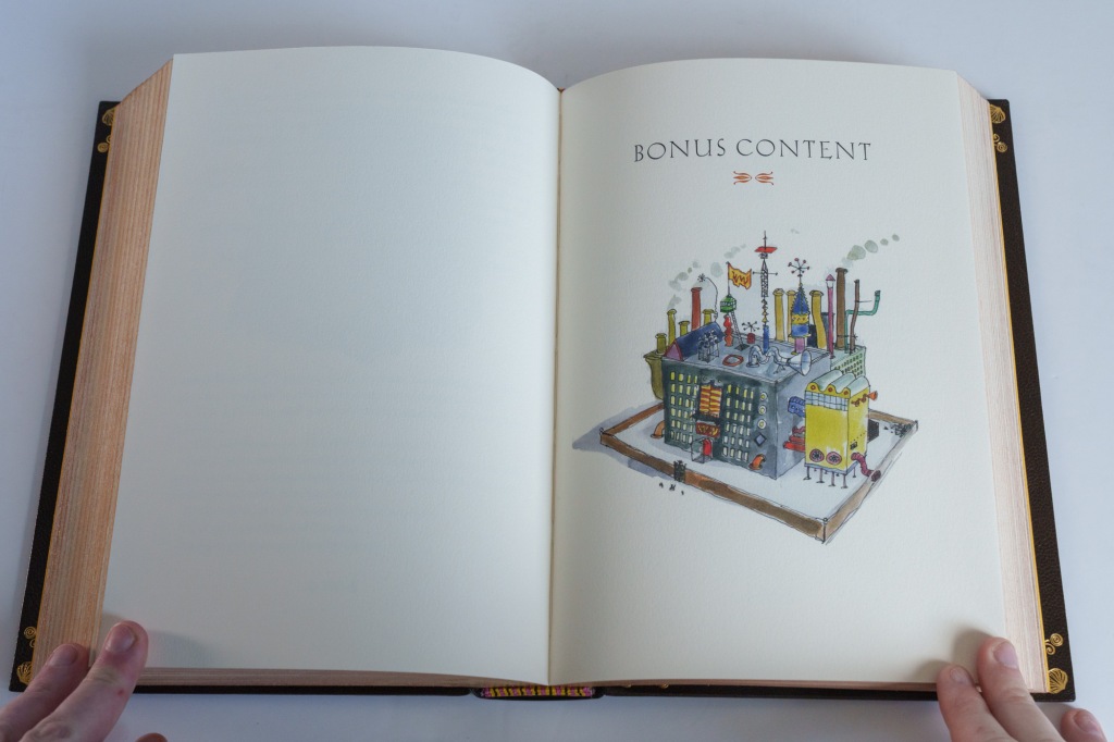
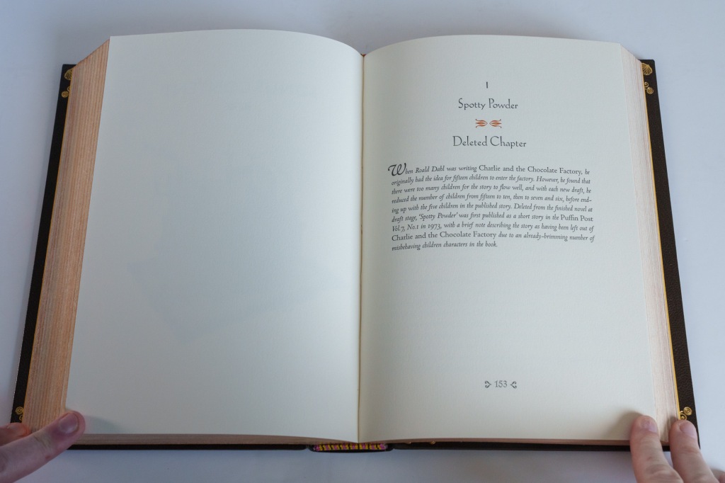
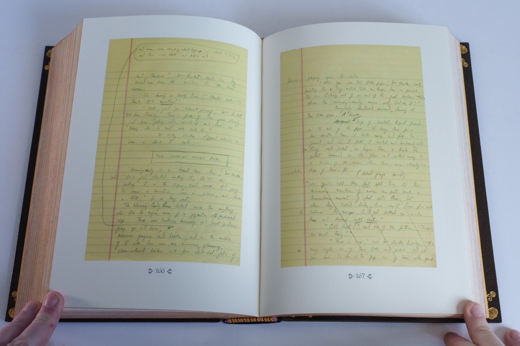
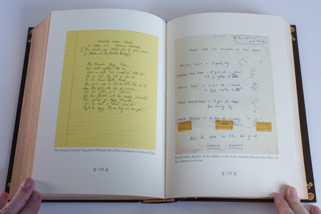
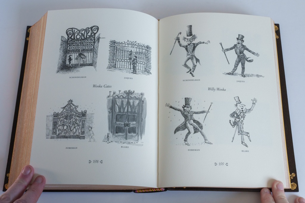
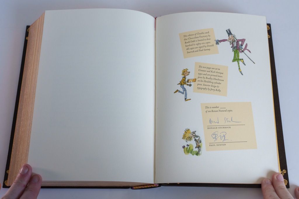
The book opens with an original introduction penned by Donald Sturrock, who wrote a biography of Dahl and is therefore well-qualified for the job. The introduction does a nice job of narrating the genesis of Charlie and the Chocolate factory, and its roots in Dahil’s personal tragedies. At the end of the book is a substantial collection of additional materials—about 66 pages worth. These include numerous deleted chapters, reproductions of Dahl’s original manuscripts, a nice gallery comparing the work of four different illustrators for various editions of the book, personal photographs, and a letter sent by Dahl to a young Paul Suntup. The book ends with a numbered colophon page signed by Sturrock and Suntup.
Summing up
It’s hard to imagine a future during my lifetime when this roman numeral state isn’t the ultimate edition of Dahl’s most famous work. But, admirably, the Suntup Press has spread the wealth around: all four states of the book contain the same substantive material—introduction, illustrations, text, and bonus content. In addition:
- each of the four states has its own distinctive and thoughtful design;
- the numbered, lettered, and roman numeral states share letterpress printing,;
- the lettered and roman numeral copies also share in common the Rives Heavyweight mould-made paper.
So every state of the edition has something to offer. What sets these roman numeral copies apart, besides the sheer exclusivity of the low limitation, is surely the superlative binding work. In its physical construction and exterior design, the book is a work of art, and an object of true beauty and craftsmanship. ■
Where to buy
The publisher’s page for this edition is at https://suntup.press/charlie-and-the-chocolate-factory/. At the time of recording the book is out of print, but Suntup produces a constant stream of editions that can be viewed on their site.
~
For those looking specifically for Charlie and the Chocolate Factory, you can search for used copies of this edition:
eBay US*, eBay UK*, AbeBooks US*, or AbeBooks UK*.
Or browse more generally for Suntup Press books with the following links:
eBay US*, eBay UK*, AbeBooks US*, or AbeBooks UK*.
* These are affiliate links. Buying a book via one of these links produces a modest revenue for this site at no additional cost to you. Any revenue thus generated is recycled into supporting the activities of this site.
