The maiden publication of Conversation Tree Press is an edition of J. M. Barrie‘s classic childhood stories of fantasy and adventure, Peter Pan. This collects two tales: the short story Peter Pan in Kensington Gardens that contains the character’s first appearance in literature, and the novel Peter and Wendy, a later and more mature work that contains most of the elements now intimately associated with Barrie’s creation. This edition has been issued in a total limitation of 726 copies, comprising three states: 500 standard, 200 deluxe, and 26 lettered. The press’ proprietor, Tony Geer, was kind enough to provide loan copies of each state for the purpose of the review below.
All three states share a few features in common. They were all set in Austin type and printed letterpress at Nomad Letterpress on about 250 pages. This page count includes a nine-page introduction by scholar Maria Tatar that introduction provides a quick tour of Peter Pan’s place in the lineage of children’s fantasy literature and some of the main themes underlying the stories. Binding was handled by Ludlow Bookbinders, making the physical production of the book an all-British affair.
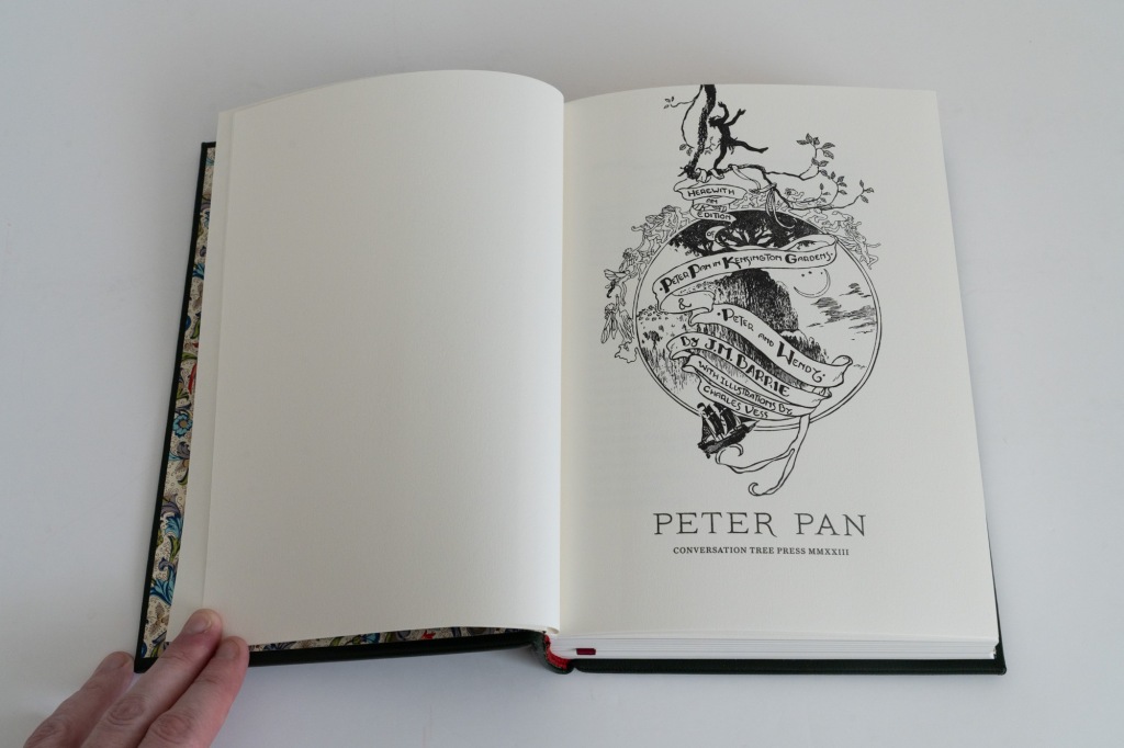
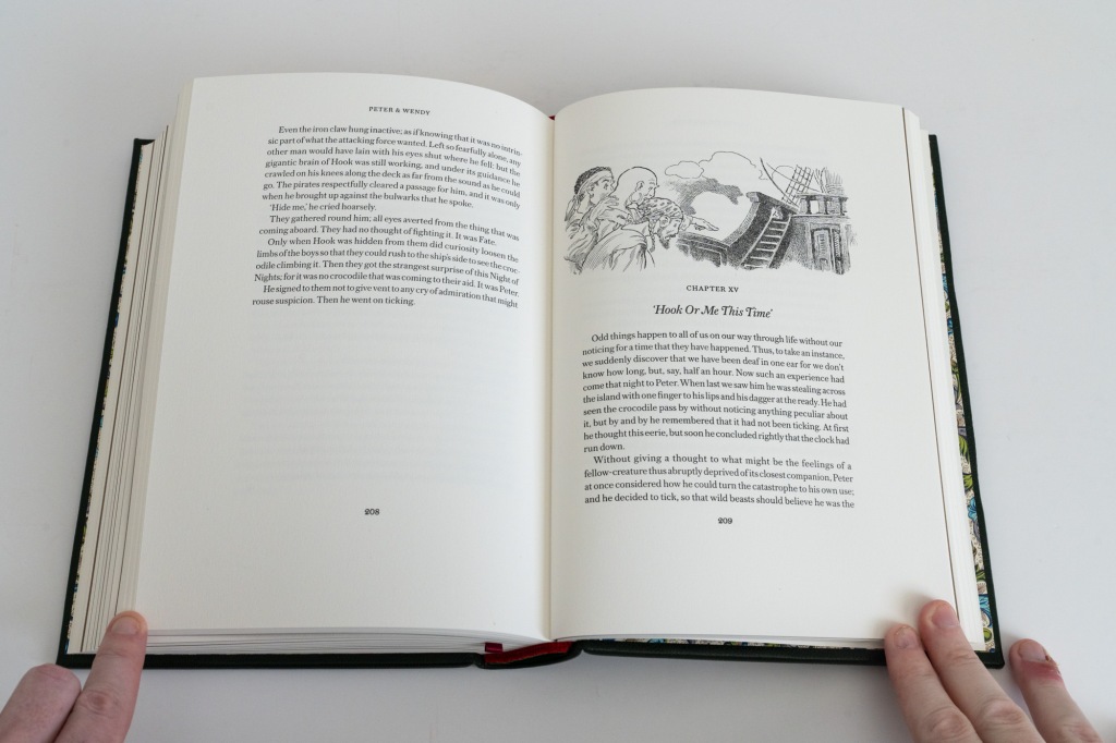
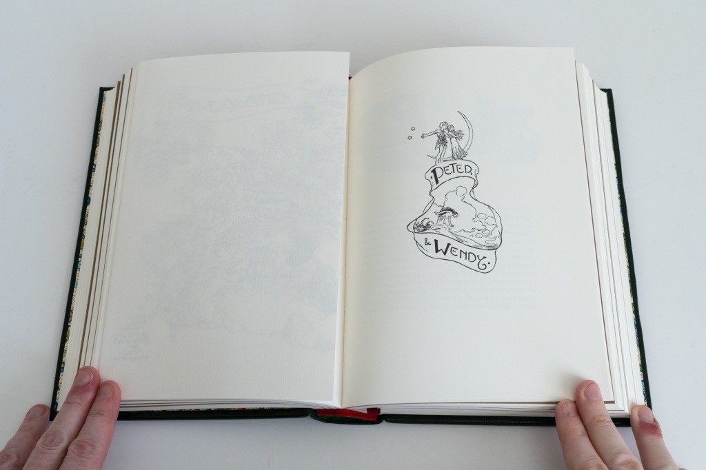
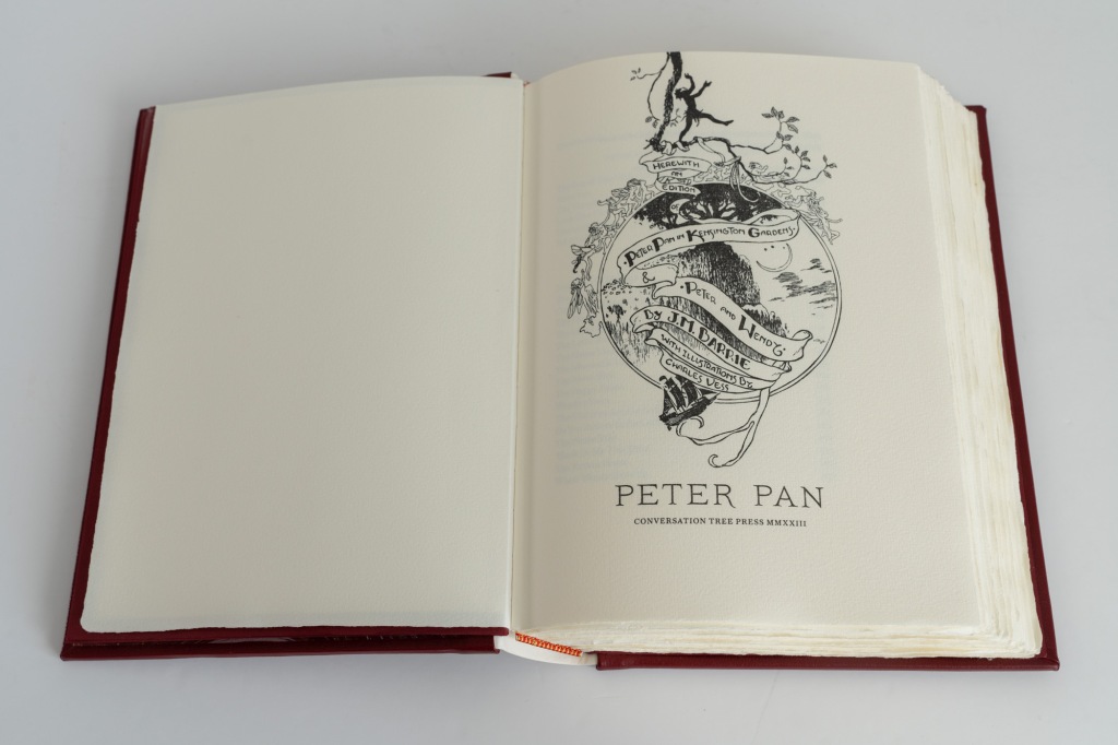
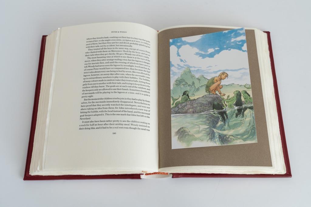
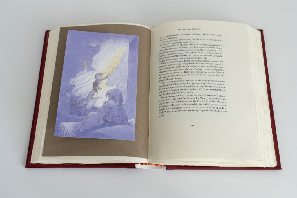
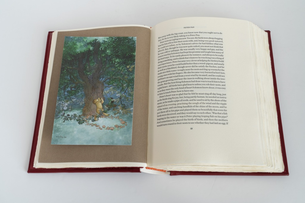
The book was illustrated by Charles Vess who provides nine colour images, two hand-drawn maps and (by my count) twenty six line illustrations. Altogether, this makes a fairly generous complement of images. The line illustrations include a drawn title page, a title page for each of the two stories, and a header for each chapter.
Turning to the colour illustrations, Vess cites the great illustrator Arthur Rackham as an influence and it shows. Like Rackham, who illustrated the first edition of Peter Pan in Kensington Gardens, Vess’ images are drawn with pen and wash style, have a strong contour, show controlled use of colour, and are full of characters with personality. But Vess also has his own distinct style that gives the images a more vibrant and modern edge. Most importantly, this style is superbly suited for a fantasy work such as Peter Pan and it is easy to see why Vess has made a name for himself with such illustrating work.
Standard state
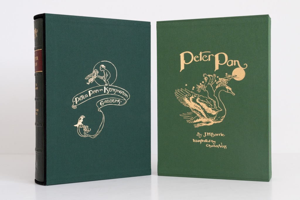
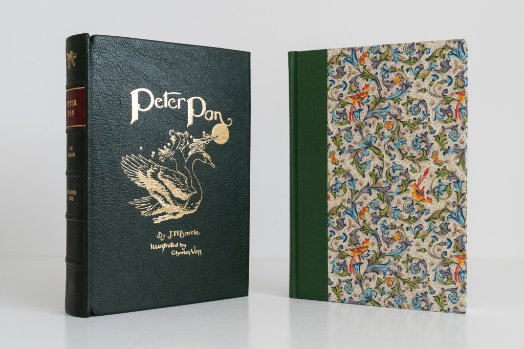
Of the standard state there are 500 copies issued at a retail price of US$275. Each is presented in a slipcase covered in apple green cloth and stamped in gilt with an illustration by Charles Vess along with the title and author’s name. The slipcase is made from a heavy duty board and feels solid with neat sharp corners that speak of quality workmanship. The case is lined with a black suede-like material that serves the dual purpose of protecting the book from abrasion and adding a touch of luxury should you be tempted to jam your hand inside the slipcase for some reason.
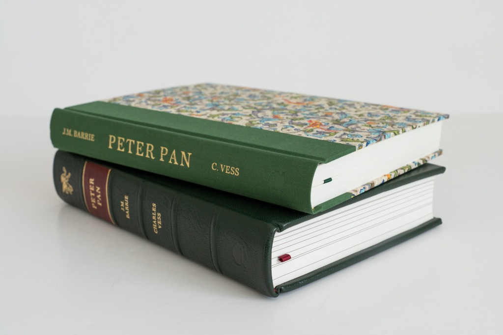
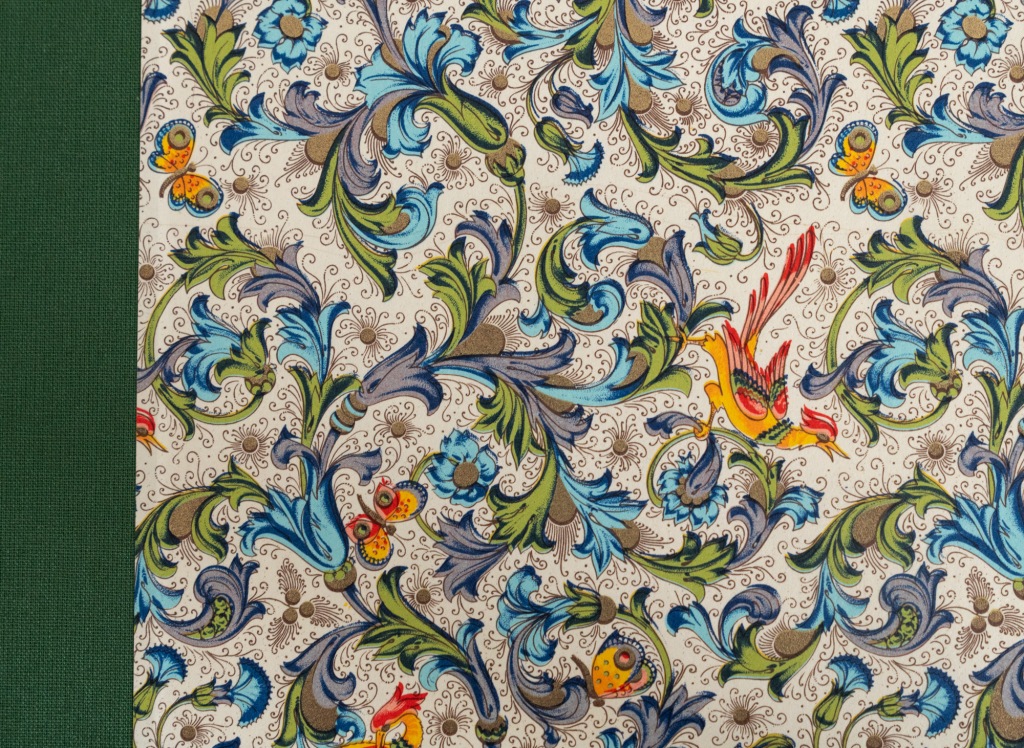
Within is a book quarter bound in green cialux book cloth over paper sides. We need to talk about this paper. Manufactured by Italian firm Rossi1931, the paper is densely pattered with an intensely colourful floreated design featuring birds of paradise. Parts of the design are embellished in gold and sparkle in the light. The whole thing is somewhat like a firework going off and this is not only fitting for a book that contains the full vibrance of Neverland, but it also makes the book a captivating aesthetic object in its own right. You’ll have to take my word for it because photographs really don’t do it justice.
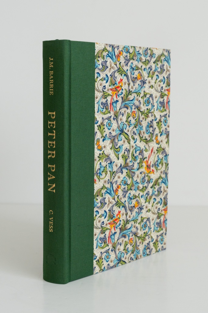
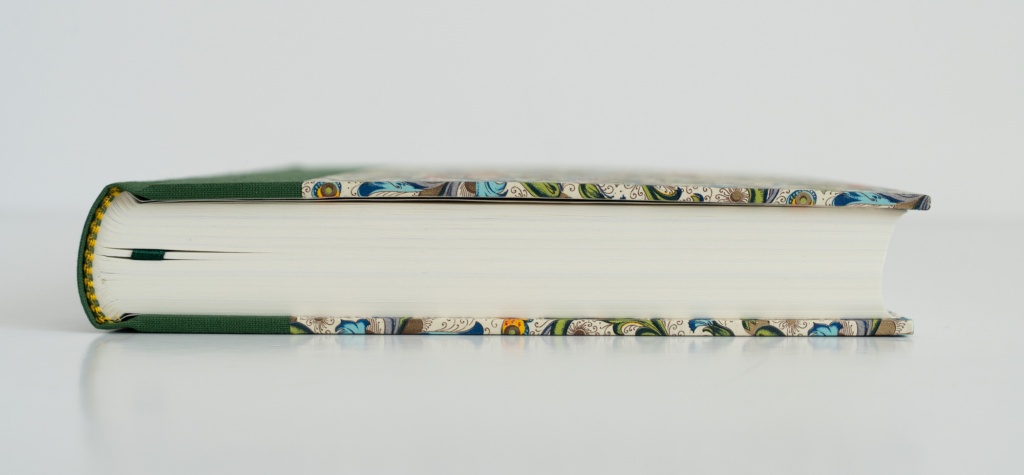
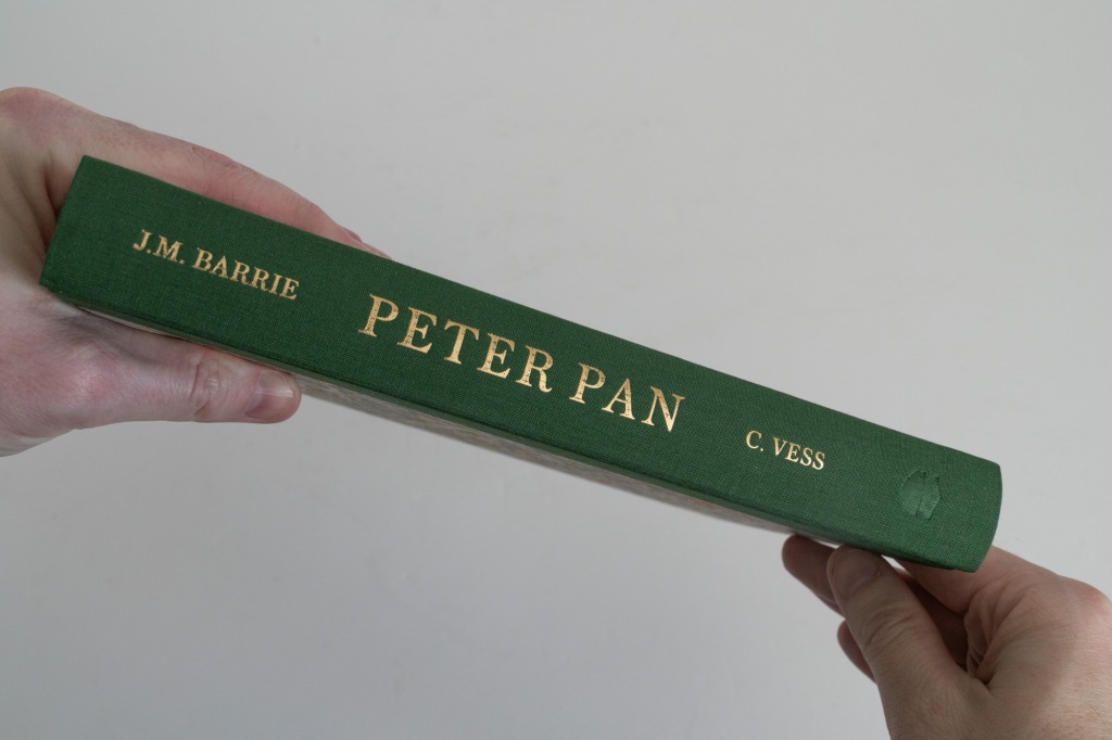
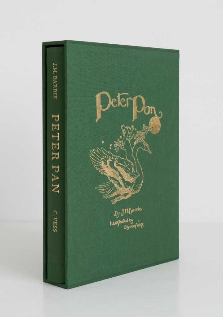
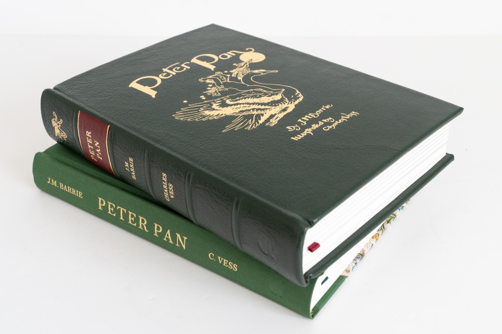
Like the slipcase, the board material used on the book feels thick and dense, lending the entire volume a sense of well-made solidity. All the corners are clean and sharp and betray a first rate binding job. The author’s name, title, and illustrator’s name are blocked in gilt on the spine, which has also been blind stamped with Conversation Tree’s pressmark. Finishing up the exterior presentation are green and yellow striped end bands and a 240mm × 170mm (6.7″× 9.5″) text block that is trimmed on all three edges.
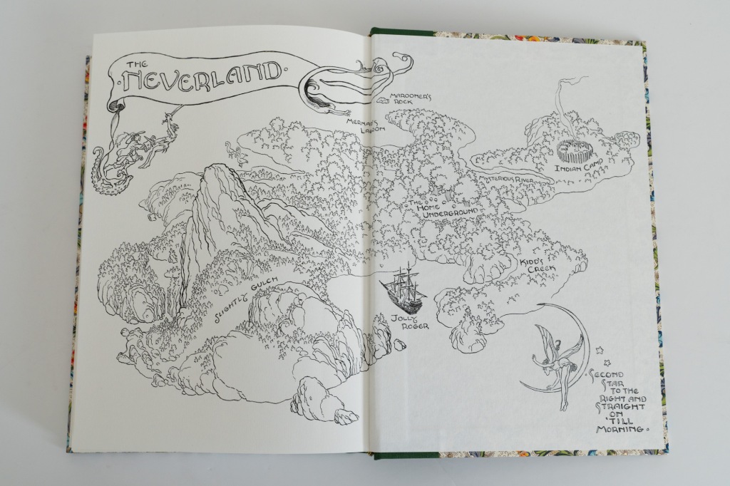
We open the book to endpapers printed with a hand-drawn map by illustrator Charles Vess. The front and rear endpapers differ—one with a map of Kensington Gardens and the other a chart of Neverland, respectively the principal locations of the two stories. Both maps are printed black on white. Meanwhile, Vess’ colour plates are here printed on Nova Matt 130gsm paper bound into the book. This paper has a satin finish and is quite sympathetic to the images, which are clear and vibrant as a result. Each image occupies about 80% of the page and is surrounded by a printed decorative border.
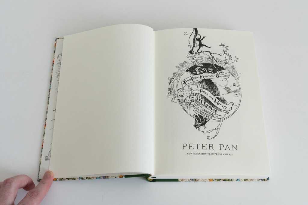
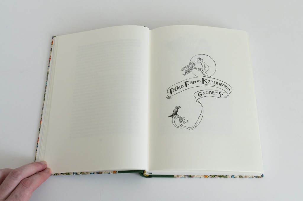
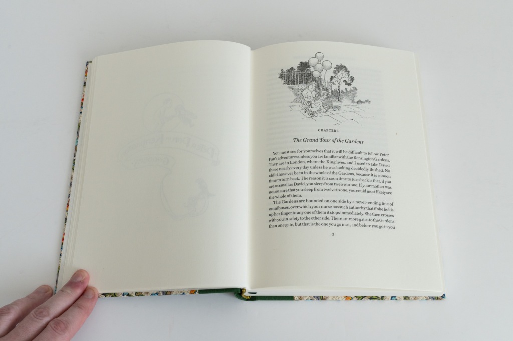
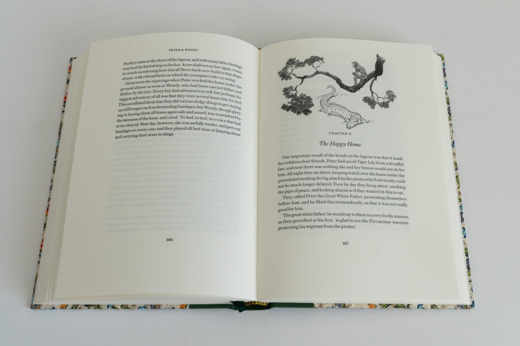
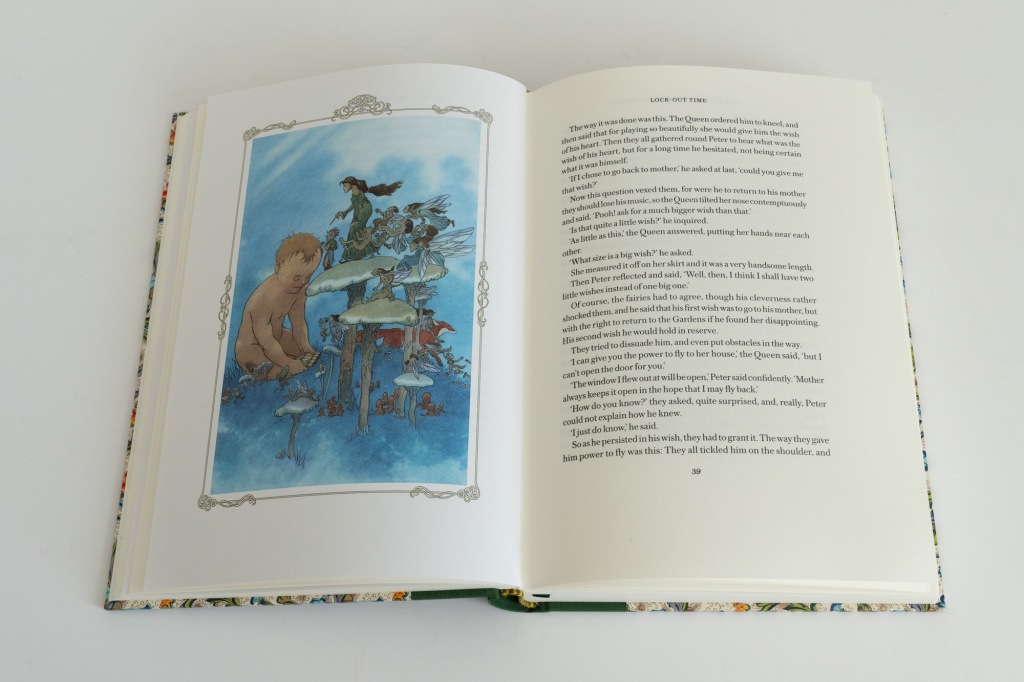
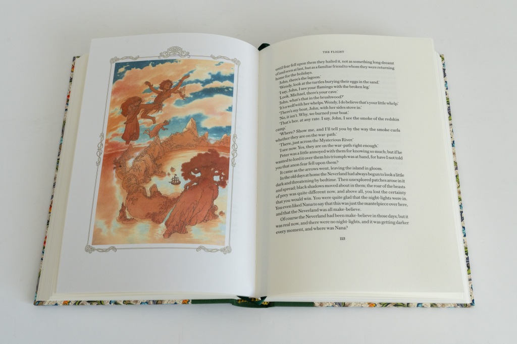
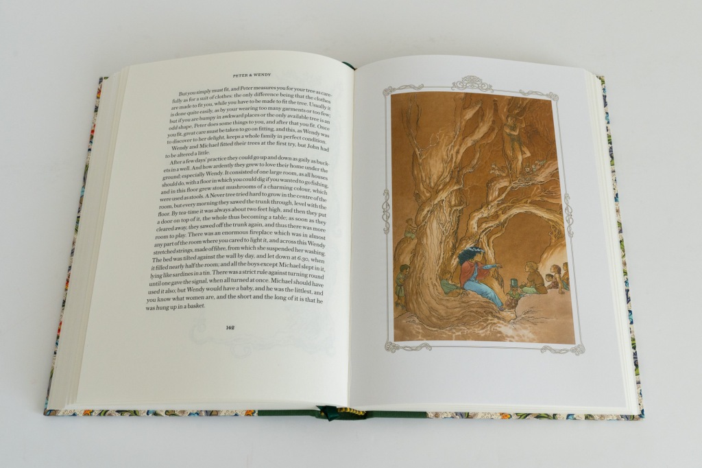
The standard edition text block is printed on 120gsm Munken Pure Rough Cream paper. Despite the name, this is a relatively smooth (but matte) paper with a slight off-white colouration. It has a good weight and opacity and is altogether a decent and thoroughly modern feeling paper. The book is well bound and sits comfortably open when placed on a flat surface. Lastly, there’s a green ribbon marker.
Deluxe state
The deluxe state has a list price of US$775 but offers a number of upgrades over its standard counterpart. These start with the slipcase, which is still crafted from heavy-duty boards covered in cloth (although the cloth colour changed from the standard edition’s apple green to a slightly darker shade). But now the slipcase is wider to accommodate a fatter book and has rounded ends to neatly cover the spine. The black suede-like lining now extends out of the slipcase to form a neat trim around its opening. This lends a slightly luxurious tactile sensation as you bring your hand up to remove the volume. The two sides of the slipcase are now blocked with different gilt designs bearing the titles of the two stories in the book.
As one might expect, the biggest upgrade for the deluxe copies is in the binding. This is now in full green leather with a nice visible grain. The front board is blocked in gilt with the same design that was on the slipcase of the standard edition. The spine is hubbed with five raised bands. The title, author’s name, illustrator’s name, and a small vignette image of Peter are all blocked in gold, the first against a wine read background. Overall it’s a thoroughly traditional presentation. As with the standard edition, the Conversation Tree pressmark is blind stamped on the spine. I think this is an especially nice touch for the deluxe state because it ensures the attractive classical austerity of the binding is not besmirched with conspicuous commercial branding.
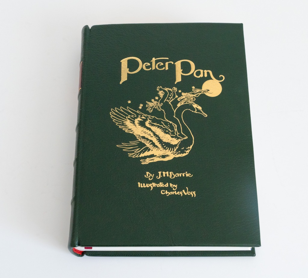
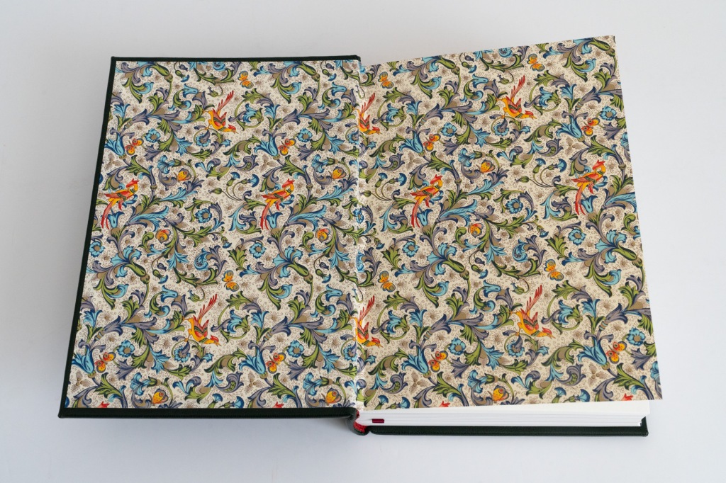
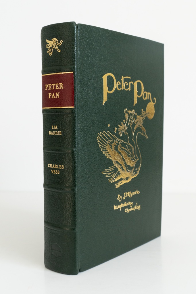
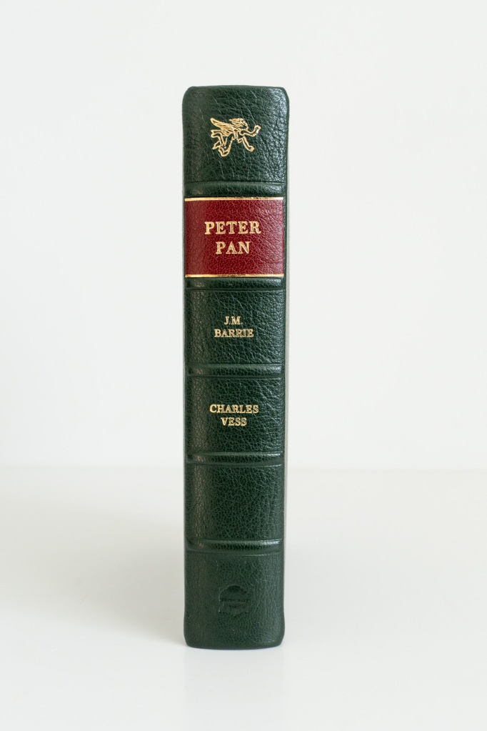
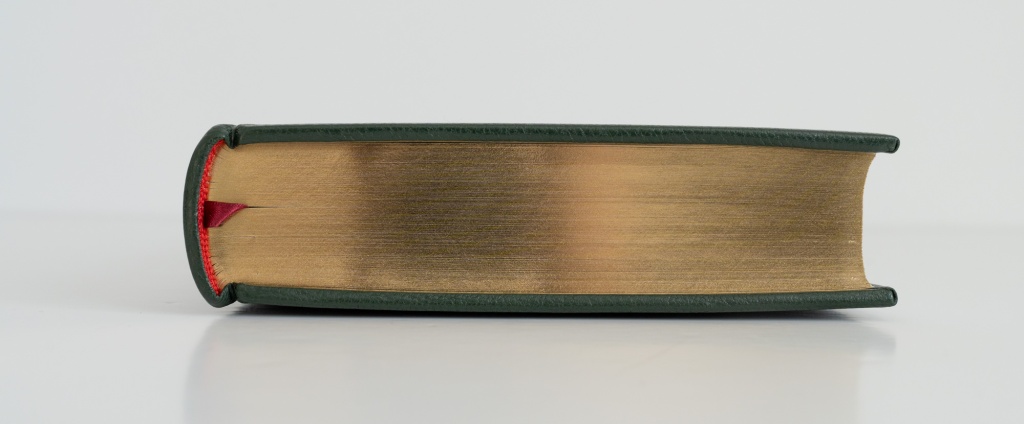
The binding now has red end bands with a matching red ribbon marker, making a nice contrast with the green binding. Unlike the standard state, the top edge of the text block is gilded.
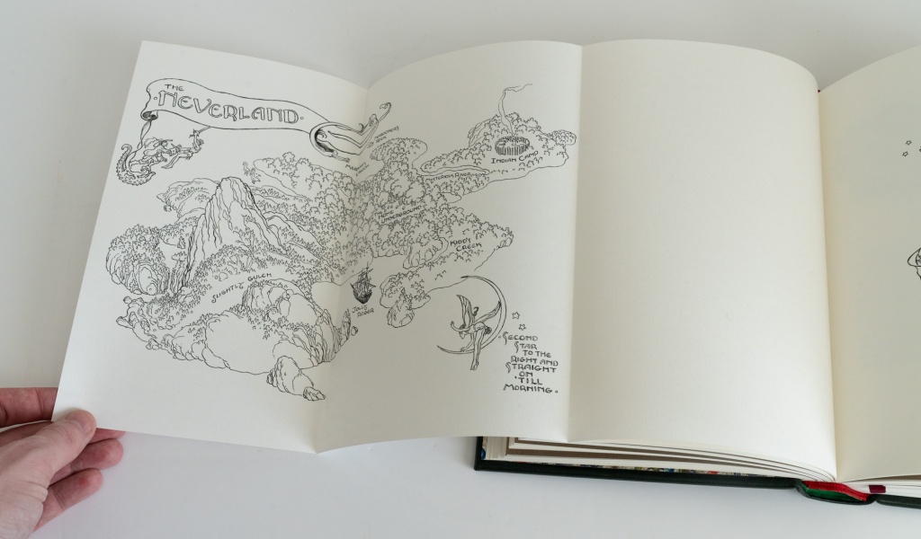
Wait, I hear you say! Leather is great, but what happened to that spectacular paper from the standard binding? The news is good: that same paper now makes its way into the book where it serves for endpapers. In turn, the maps that were on the standard edition’s endpapers are now included on bound-in fold-out sheets. Here I think the black-on-white colour scheme of the maps feels a little bit less stark than it did on the standard edition’s end papers. Although the maps span two pages, they are are tri-fold rather than bi-fold; perhaps it’s just me, but this makes it feel more like you are opening a real map ready to begin your explorations. More substantively, it makes it possible to consult the map while reading elsewhere in the book.
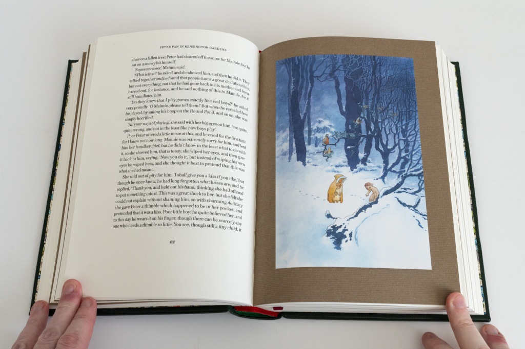
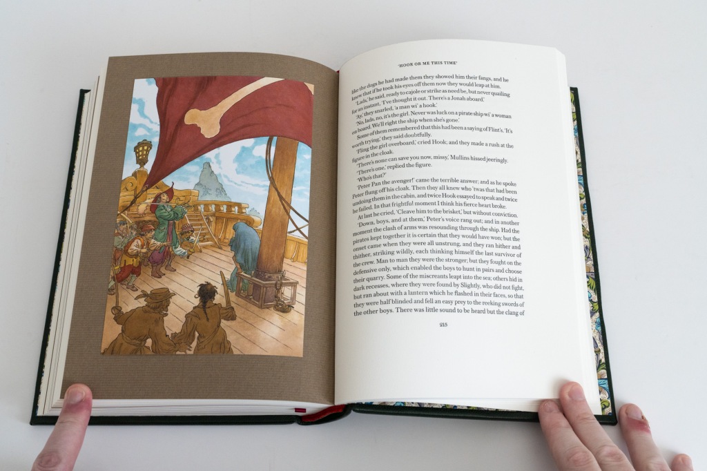
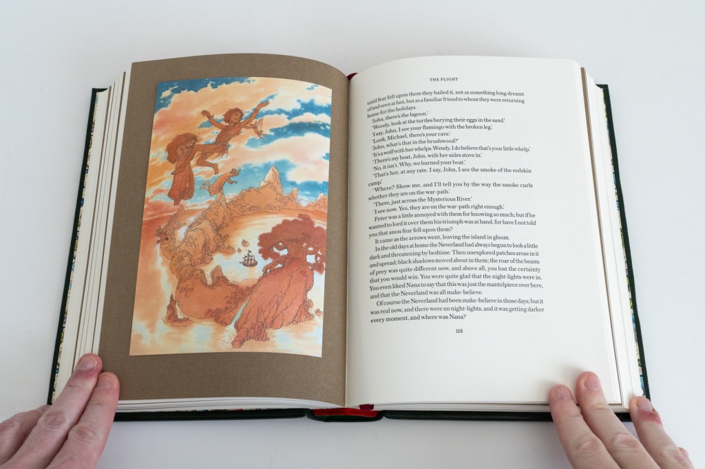
The presentation of the colour plates has also changed. The paper weight has been upgraded to 150gsm. More significantly, to my mind, is that instead of being printed with a border and bound in, these are now trimmed to size and tipped onto sheets of a brown laid paper. I prefer this. The subtle brown earthy tone directs attention inward to the artwork where it belongs. The laid paper is also more tactile than the satin stock on which the images themselves are printed.
Rounding out the differences from the standard state, the paper of the text block is a heavier Magnani Pescia Edition 160gsm (110#) paper. I don’t care too much about the increased weight, but this paper is slightly rougher and more opaque, which again makes it a definite upgrade to my mind. Owing to the thicker paper, the deluxe state comes out as a thicker and heavier book overall, but not in a way that is problematic for reading. The text block has the same size as the standard edition and is again trimmed on all three edges.
Lettered state
The lettered state represents the top end of Conversation Tree’s offering in this edition of Peter Pan. Its list price was US$2,695 but it is already fully subscribed at the time of writing.
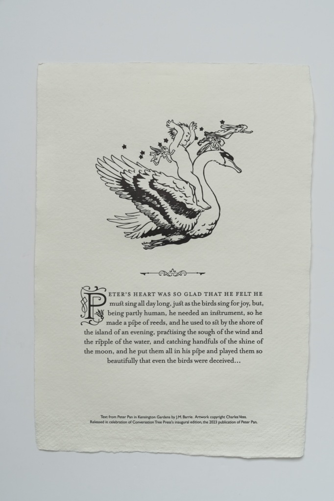
Before we even get to the book, we are greeted upon opening the shipping box by a broadside of approximately A4 size with four deckled edges. I believe it is on 300gsm 100% cotton rag paper and it feels absolutely luxurious. Printed on one side is Vess’ line illustration of Peter atop a swan (featured on the slipcase of the standard edition and the front board of the deluxe. There is also a one-paragraph excerpt from Peter Pan in Kensington Gardens with an ornate drop cap, and a brief note that the broadside was printed to celebrate the release of the edition.
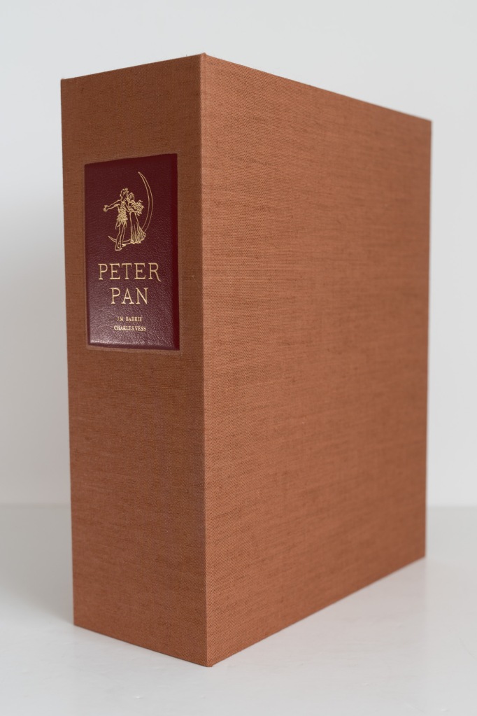
As with the step up to the deluxe, the first major upgrade we encounter is in the book’s case. The slipcase has been replaced with a substantial solander (clamshell) box covered in cinnamon brown Italian linen cloth that feels quite pleasant to the touch. The only major exterior embellishment is a large crimson leather label. It bears in gilt the title, author’s name, illustrator’s name and another line illustration, this time of Peter and Wendy beside a crescent moon. The label’s edges are neatly bevelled and it is set inside a slightly recessed panel on the box’s spine.
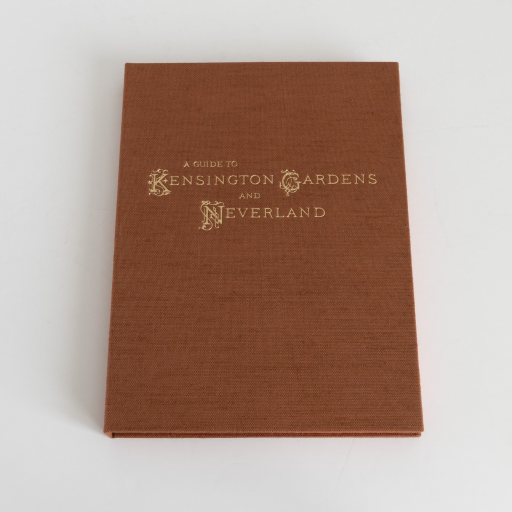
I enjoy solander boxes because they always make the occasion of opening them to peruse the contents feel a bit special. Within we find that the inner surface of the box’s spine is covered with a marbled paper by Freya Scott. It’s metallic and catches the light nicely. Facing off across this spine are two framed compartments lined with a brown suede-like material. In the verso compartment is a folio retained in place by two rotating brass clips. The folio is covered in that cinnamon brown linen cloth and blocked on the front with “A Guide to Kensington Gardens and Neverland”, including three ornate capital letters. It contains two pockets, each holding a folded sheet printed with one of the two maps drawn by Vess. There’s a gold ribbon pull to elegantly lift the folio from its recess.
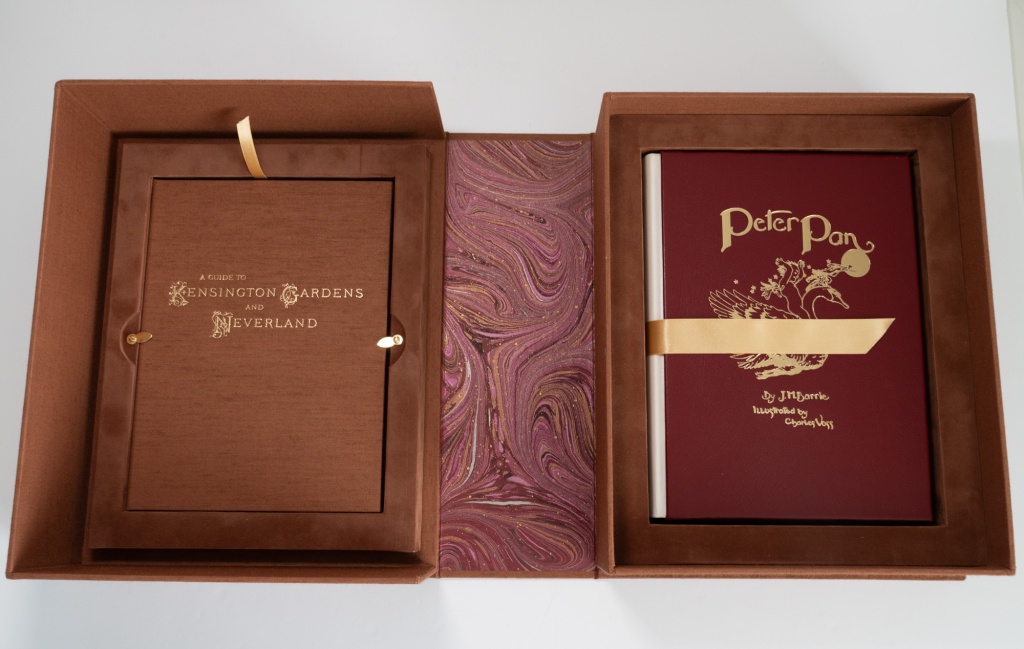
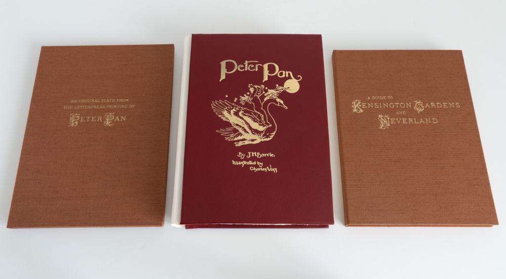
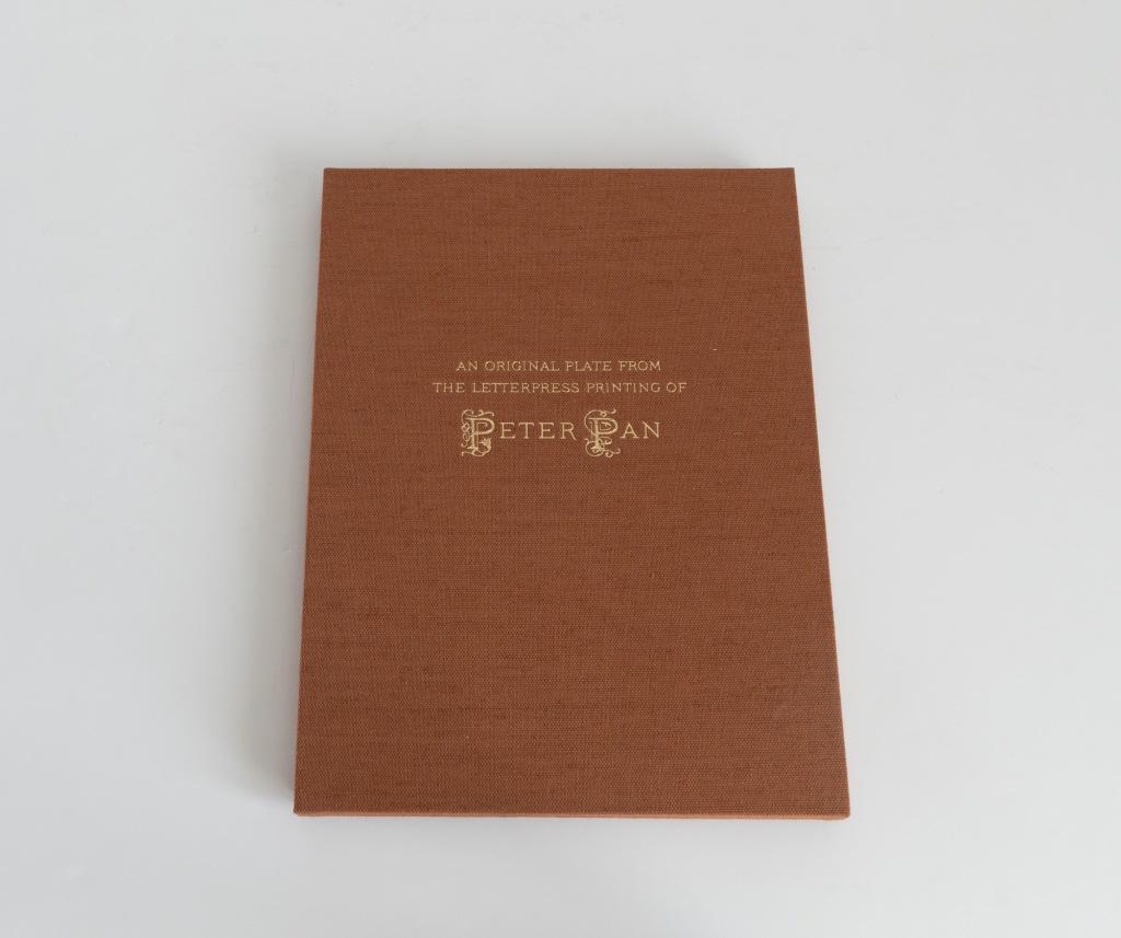
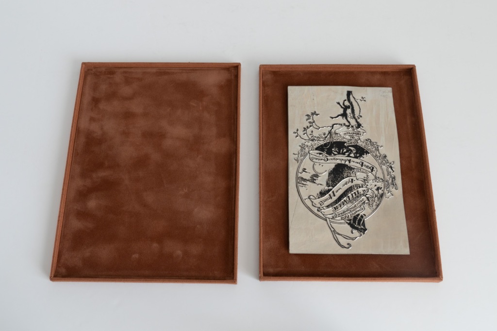
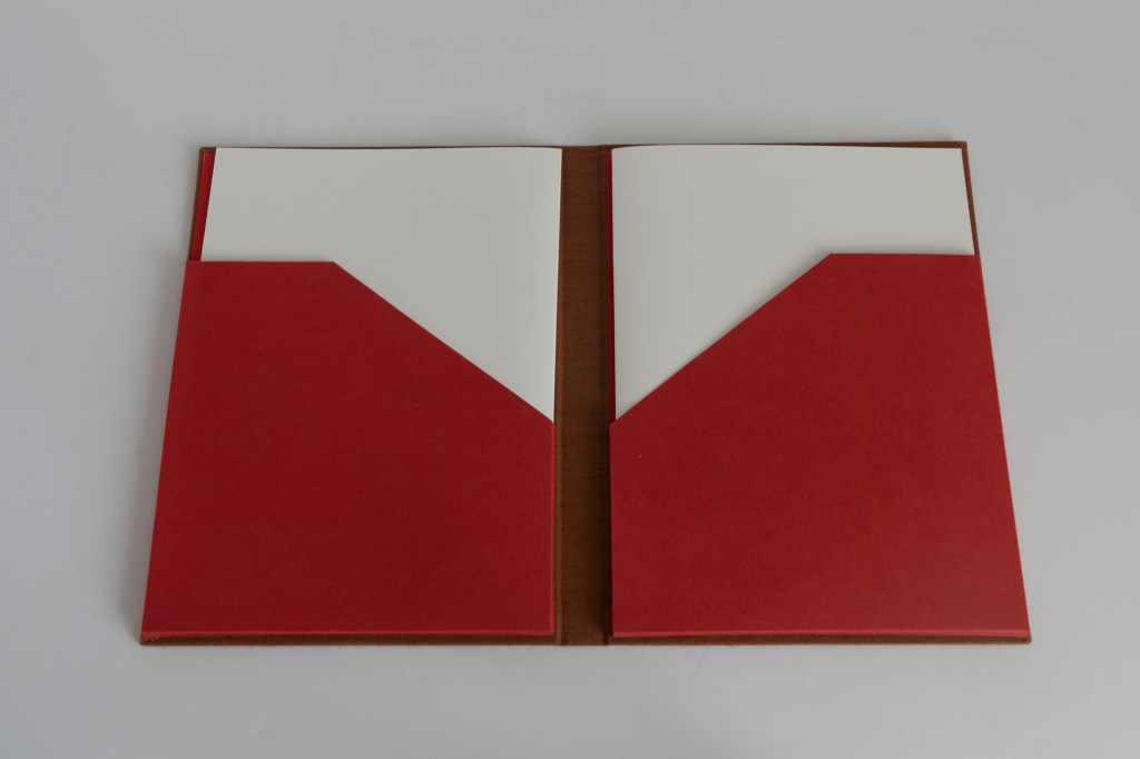
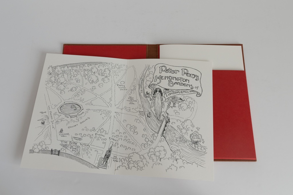
Over on the recto side of the box we see first the main volume. This will, of course, be described in detail below. But first let me remark that nestled below the book is a two-piece box covered in the brown linen and lined in the brown suede-like material mentioned above. Blocked on the front of the box is “An original plate from the letterpress printing of Peter Pan”. Sure enough, mounted inside is a magnesium plate from which a page was printed. It’s quite neat to know that there are 725 other copies out there that have all seen the kiss of the piece of metal we’re looking at. Helping us get the book and box out is another gold ribbon pull, this time about 2.5cm (1 inch) wide.
Now, to the book. We have a Bradel binding, a kind of quarter binding where the spine material tucks under the front board rather than wrapping around onto the sides. This is uncommon enough to be a nice novelty. The boards are covered in a crimson leather and it’s quite luxurious. It feels robust but soft at the same time, smooth but with a visible and even grain. The front is blocked in gilt with the same design that adorned the front board of the deluxe state, though I will say that the gilt looks especially handsome on its red ground. The spine is vellum, blocked in gilt with the title running vertically along almost its whole length. Over the top (or underneath?) of each letter has been blind stamped a unique calligraphic swash. The conversation tree pressmark is also blind stamped at the tail of the spine. Overall, I appreciate the binding for its understated elegance.
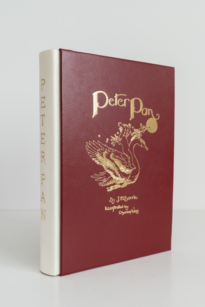
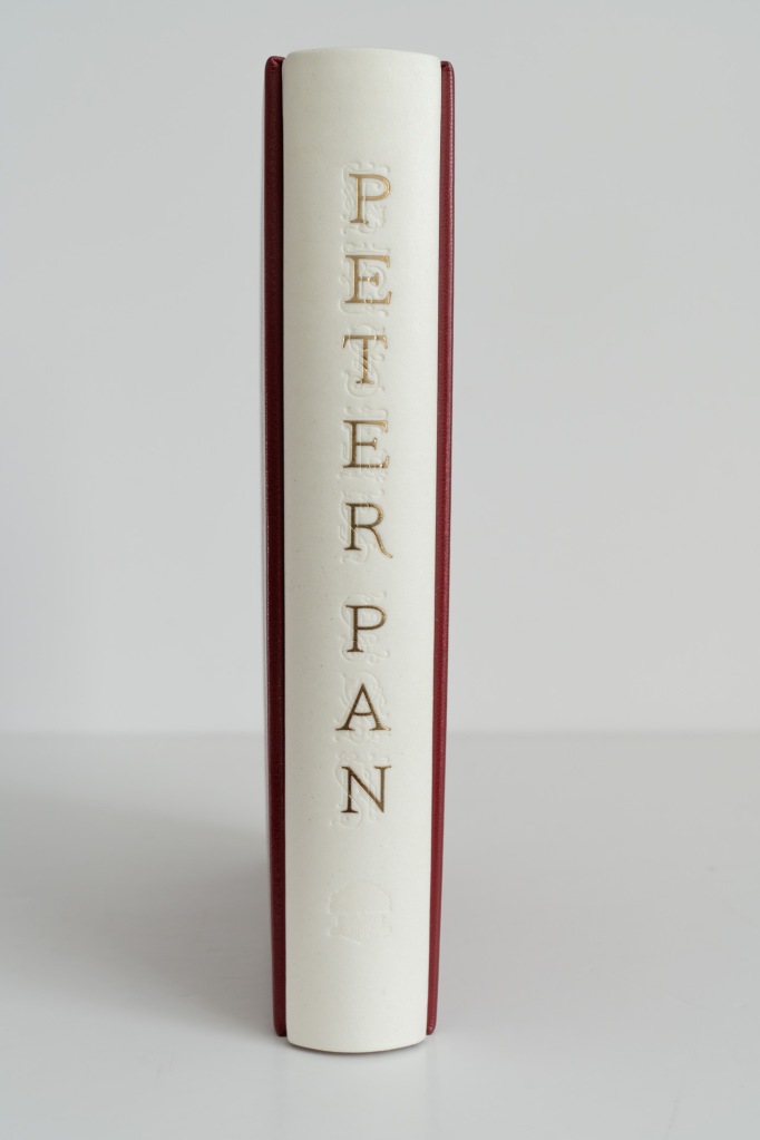
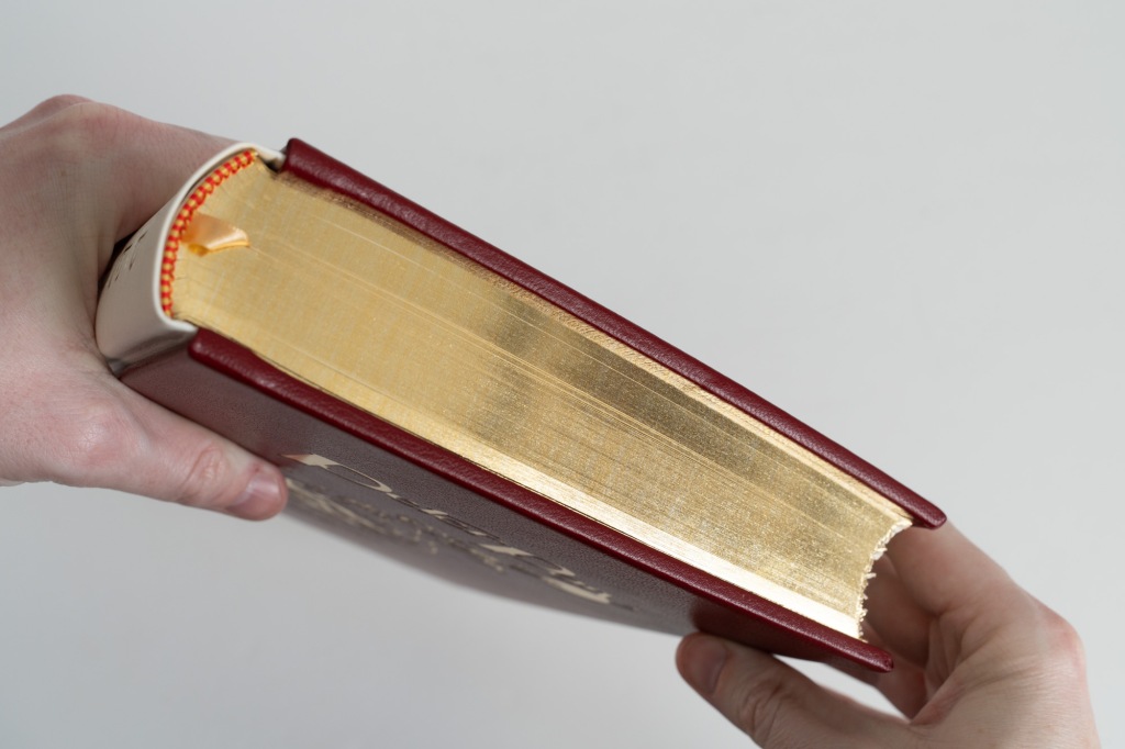
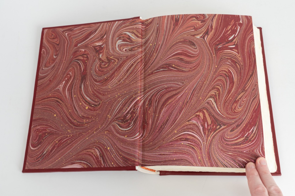
To finish with the externally visible details: the top edge of the text block is gilded, the bottom and fore edges have been left untrimmed, we have red and yellow hand-sewn end bands, and we see a glimpse of a gold ribbon marker. Opening the front cover leads us to end papers of that nice marbled paper we already saw inside the solander box.
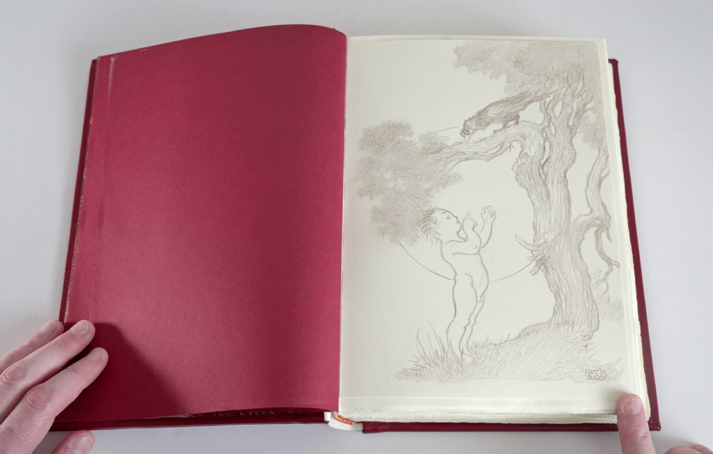
The Conversation Tree website promises “a remarque (small illustration) by Charles Vess”. It transpires that this “small illustration” is nothing short of a full page original hand-made pencil drawing made and initialled by Vess. It is bound in directly after the front endpapers.
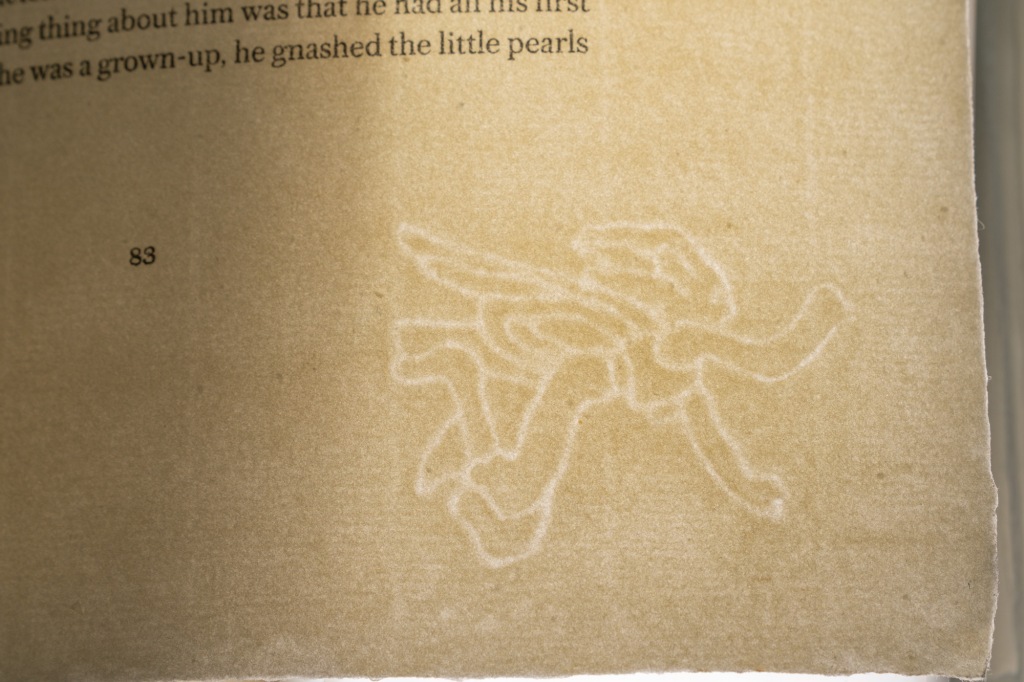
The paper in this lettered state has, to my mind, seen a very substantial upgrade. We now have paper from the Czech Losin mill—a legendary name in fine press circles. This is a 145gsm hand made paper with a wonderful tactile texture that reminds me of great private press books from the early 20th Century. It’s quite delightful and pairs nicely with the naturally deckled edges. This was a special making of the paper bearing a fairy watermark by Charles Vess that forever ties it to this edition.
Like the deluxe state, the colour plates are here trimmed to size and tipped in onto brown laid paper. However, the printing of the images has seen an upgrade. They are now printed on an archival Somerset paper, which is a matte stock with a bit of tooth to it, similar to a cold-pressed watercolour paper. Normally, printing full colour plates on paper with a matte and textured surface comes at the cost of reduced vibrancy, but the printing is here done by a giclée process (essentially, a high-end digital inkjet print). They are every bit as bright and crisp as the images in the other states, but this combination of paper surface and printing technique could probably trick some viewers into believing they were looking at an original watercolour.
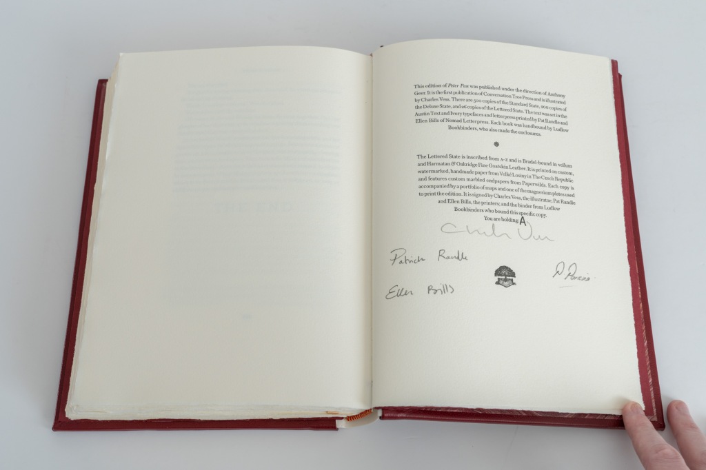
The colophon page is hand-lettered and signed by the illustrator, printers, and binder.
Summary
Spending time with these books made me excited about Conversation Tree Press’ arrival on the fine press scene. Much credit is due to the craftspeople at Nomad Letterpress and Ludlow Bookbinders for producing a quality product. But I also thought there was a good coherence of book design in this edition—important for a fine press publisher that is coordinating the production work rather than doing it in-house.
The standard state feels like a very nicely made book at an eminently reasonable price point. We get the full complement of images and the letterpress printed text, not to mention that captivating binding. Meanwhile, it’s hard to imagine those who opt for the deluxe state being disappointed: almost every physical aspect of the book has seen an upgrade. The star attraction of the deluxe copies will be that classic leather binding, but I particularly appreciated the treatment that the illustrations and maps received in this state. The lettered state comes at a big increase in price, but serves to demonstrate that Conversation Tree knows how to deliver a high-end edition. That are nice touches to make each copy feel unique and special, and that Losin paper is to die for. ■
Where to buy
At the time of writing, the standard and deluxe states of Peter Pan are in print and can be purchased directly from the Conversation Tree Press shop. Readers are cordially encouraged to exhaust this source before searching elsewhere.
—
For those arriving here after the books are out of print, you can search for used copies of the edition:
eBay US*, eBay UK*, AbeBooks US*, or AbeBooks UK*.
Or browse more generally for Conversation Tree Press books on the secondary market at:
eBay US*, eBay UK*, AbeBooks US*, or AbeBooks UK*.
* These are affiliate links. Buying a book via one of these links produces a modest revenue for this site at no additional cost to you. Any revenue thus generated is recycled into supporting the activities of this site.

One thought on “Peter Pan by J. M. Barrie (Conversation Tree Press, 2023)”